Branding
This page provides an overview of branding guidance for Omni reports, data visualizations, and web products. Omni’s visual identity, including color palettes and design standards, is outlined in detail in our branding guidance ([add link once ready T/Lauren]).
At the same time, branding should be responsive to context and audience. Projects may be adapted to align with CSI branding, or tailored to be fully client-branded or co-branded with Omni, depending on project needs and partnership agreements.
This page brings together key information and examples to support consistent, flexible application of branding across these scenarios.
Color Palette
Omni’s core colors do the structural work in every report: for text and headings, white for the page background, and chart gray (#767676) for non-highlighted chart elements and muted text. Steel-blue carries longer passages of body text and is the base color for client-branded work.
The secondary palette supplies one highlight per chart and draws attention to key findings: plum, teal, periwinkle, olive, and orange-red. Golden yellow is reserved for limited decorative use only. It is excluded from charts and text because it does not meet WCAG contrast standards on white.
When to Use Each Color
Write plain narrative in navy. Reserve the secondary colors for data visualization, highlighting metrics, and drawing attention to warnings or key findings. In charts, keep every non-highlighted element in chart gray so a single highlight color carries the attention. See the examples below for guidance.
Color Swatches
Chart Gray
#767676
Non-highlighted chart elements (bars, lines, dots) and muted text such as axis labels and source notes.
Periwinkle
#5776B2
Links, interactive elements, and data viz accents.
Teal
#41816F
Data visualizations, section labels, and positive highlights.
Olive Green
#3B5530
Data visualizations and supporting color in charts.
Orange-Red
#CC4100
Warnings and alerts. Avoid for body text.
Plum
#921C4C
Warnings, alerts, and key metrics that need attention.
Golden Yellow
#F7B925
Decorative use only. Excluded from charts and text because it does not meet WCAG contrast standards on white.
Use Case Examples
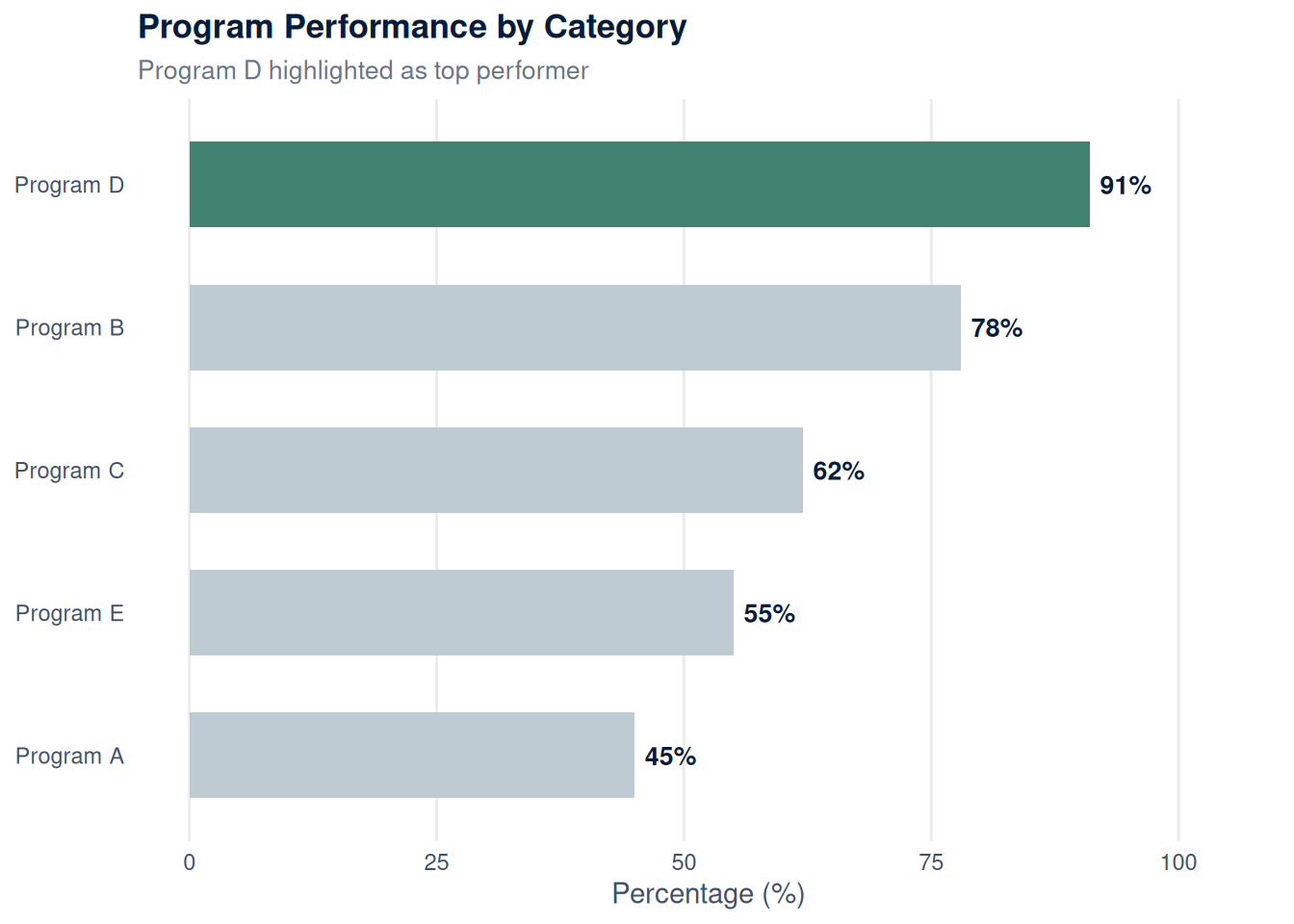
Use teal or periwinkle to draw attention to a single important number in a stat card or chart. Keep every other element in chart gray (#767676) so the one highlight color carries all the attention.
87%
Example of teal used to highlight a single important metric.
64%
Example of periwinkle used to highlight a single important metric.
Give each chart one highlight color from the 600-level secondary palette, and keep every non-highlighted element in chart gray (#767676). Steel-blue is no longer a chart color: it is reserved for body text and client-branded work. For multi-series charts, use the fixed categorical order (periwinkle, orange-red, plum, olive, teal) and never mix 400-level and 600-level colors in one chart.
Use orange-red or plum to flag something the audience should pay attention to, such as a data limitation, a risk factor, or a critical finding.
Note: This data reflects a small sample size and should be interpreted with caution.
Important: Response rates were below 50% for this subgroup. Findings may not be representative.
Never use golden yellow for body text. It fails WCAG contrast standards. Always prioritize the 600-level color families and bold colored text using **.
This text is hard to read. Golden yellow fails WCAG contrast standards on white backgrounds.
for any colored text to ensure readability and accessibility.
Chart Color Rules
These rules keep every chart on palette and accessible. They apply to figures built in R as well as any charts embedded directly in a report.
Note
- Give each chart one highlight color from the 600-level palette. Vary the highlight across a report.
- Keep every non-highlighted element in chart gray (
#767676): bars, lines, dots, and muted text such as axis labels and source notes. - Never mix 400-level and 600-level colors in the same chart.
- Error bars are always navy (
#081C39), and navy has adequate contrast only against orange-red, teal, or periwinkle highlights. With plum or olive, use a whisker plot instead. - For multi-series charts, use the fixed categorical order: periwinkle, orange-red, plum, olive, teal (five series maximum).
- Steel-blue is reserved for body text and client-branded work. Golden yellow is excluded from charts. Neither is a chart highlight color.
- Some charts need no highlight at all. An all-gray chart is the right choice when the spread itself is the point, such as a distribution or a demographic breakdown.
Logos, Icons, and Images
Thoughtful use of logos, icons, and images helps bring reports to life while reinforcing brand identity. This section provides guidance on how to incorporate Omni, CSI, and client logos, along with icons and images that enhance clarity and engagement.
CSI Branding
CSI (the Center for Social Investment) is an Omni sub-brand. CSI-branded sites use Omni’s color palette and typography, so the only change from the default template is the logo. There’s no separate brand object to build.
The use_csi_logos Argument
The simplest way to apply CSI branding is to set use_csi_logos = TRUE when you create the site:
library(omni)
create_website("my-csi-site", use_csi_logos = TRUE)
This automatically points _quarto.yml at the CSI logos (which are bundled in the omni package): the no-text logo in the navbar and the full logo in the footer. You can combine it with a brand object if you also want custom colors or fonts:
create_website("my-csi-site", brand = brand, use_csi_logos = TRUE)Swapping Logos on an Existing Site
use_csi_logos only takes effect when the site is first created. If you already have a site and want to switch it to CSI, edit _quarto.yml by hand. Replace the navbar logo with the no-text CSI logo:
website:
  navbar:
    logo: https://github.com/rfortherestofus/omni/blob/main/inst/assets/images/logo-no-text-csi.png?raw=true
    logo-alt: Logo of the Center for Social Investment
And the footer logo (the full version, with text) in the page-footer block:
page-footer:
right: |
[{fig-alt="Center for Social Investment" width=100px}](https://www.omni.org/)The use_csi_logos argument only swaps the logos. If you want the footer attribution to match, change the center copyright line from “Omni Institute” to “Center for Social Investment” yourself. Because CSI shares Omni’s palette and fonts, the color guidance and components elsewhere in this template apply unchanged.
Client Branded or Co-Branded Websites
Client branding is controlled by the brand argument of create_website(). If you leave it unfilled, create_website() behaves just like the default template, so running create_website("unbranded") creates a new directory called “unbranded” containing the standard Omni template. (The function also takes a use_csi_logos argument, covered in the CSI Branding section above.)
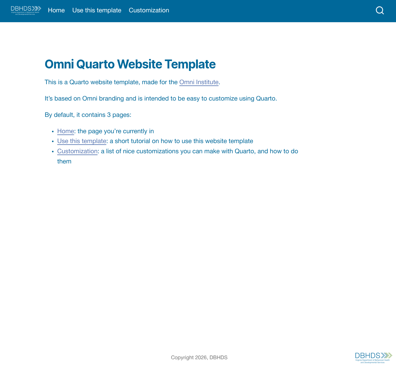
With the brand argument, you can modify the branding (colors, fonts, and logo). There are a few helper functions to generate the brand options. Because there are many options, let’s walk through an example that partly implements branding for DBHDS:
A Brand Template
The easiest way to start creating a brand is to run the print_brand_template() function. This prints an example brand specification to the console. It is the main code that governs the color and typography settings of the brand.
# Output of omni::print_brand_template()
Brand(
  meta = BrandMeta(name = "brand.yml"),
  color = BrandColor(
    foreground = "#081c39",
    background = "#ffffff",
    primary = "#081c39",
    secondary = "#677384",
    my_custom_col1 = '#ff5e34',
    my_custom_col2 = '#f7b925'
  ),
  typography = BrandTypography(
    fonts = list(
      Font(family = 'Open Sans', source = 'google'),
      Font(family = 'Inter Tight', source = 'google'),
      Font(
        family = 'Helvetica Neue',
        source = 'system',
        dir_source = 'inst/fonts/helvetica_neue'
      )
    ),
    base = FontSpec(
      family = 'Helvetica Neue',
      'line-height' = 1.6
    ),
    headings = FontSpec(
      family = "Inter Tight",
      weight = "bold"
    ),
    link = FontSpec(color = "#5776b2")
  )
)
Setting Colors
Let’s start with the easiest changes, the color settings. The colors foreground, background, primary, and secondary are mandatory. After that, you can add more colors under names you choose. For DBHDS this could look like:
BrandColor(
  foreground = "#00689A",
  background = "#ffffff",
  primary = "#00689A",
  secondary = "#75A142",
  grey = '#53575A',
  light_blue = '#48AEE1',
  yellow = '#E8B900',
  dark_blue = '#074369',
  light_green = '#97D162'
)
All of the additional colors (grey, light_blue, etc.) are also available in your Quarto document for inline text. Just as you can write [plum-colored text]{.plum-600}, you can do the same with the brand colors you specified. The naming is always .brand_<your_color_name>, so for example you could write [dark blue text]{.brand_dark_blue}.
Setting Fonts
With the BrandTypography() and Font() functions you register fonts for your document and decide where to use them. In the simplest case, you register only Google fonts:
BrandTypography(
  fonts = list(
    Font(family = 'Open Sans', source = 'google'),
    Font(family = 'Inter Tight', source = 'google'),
  ),
  # ... rest omitted
)
You can then use these font family names as the base, headings, link, or monospace font (none of which are mandatory). The FontSpec() function helps with that and lets you optionally specify the weight, size, color, and line height:
BrandTypography(
  fonts = list(
    Font(family = 'Open Sans', source = 'google'),
    Font(family = 'Inter Tight', source = 'google'),
  ),
  base = FontSpec(
    family = 'Open Sans',
    'line-height' = 1.6
  ),
  headings = FontSpec(
    family = "Inter Tight",
    weight = "bold"
  ),
  link = FontSpec(color = "#5776b2")
)
Things become slightly more complicated when you want to use a font that is not available on Google. In that case, use source = "system" and specify the directory where the font files are stored. In this example, the “Helvetica Neue” font is stored in a subdirectory font_files/helvetica_neue of the working directory:
BrandTypography(
  fonts = list(
    Font(family = 'Open Sans', source = 'google'),
    Font(family = 'Inter Tight', source = 'google'),
    ## Import new font
    Font(
      family = 'Helvetica Neue',
      source = 'system',
      dir_source = 'font_files/helvetica_neue'
    )
  ),
  base = FontSpec(
    family = 'Helvetica Neue', ## <--- Use newly imported font
    'line-height' = 1.6
  ),
  headings = FontSpec(
    family = "Inter Tight",
    weight = "bold"
  ),
  link = FontSpec(color = "#5776b2")
)
Putting It Together
All in all, a script to create a branded website looks like this:
library(omni)
brand <- Brand(
  meta = BrandMeta(name = "brand.yml"),
  color = BrandColor(
    foreground = "#00689A",
    background = "#ffffff",
    primary = "#00689A",
    secondary = "#75A142",
    grey = '#53575A',
    light_blue = '#48AEE1',
    yellow = '#E8B900',
    dark_blue = '#074369',
    light_green = '#97D162'
  ),
  typography = BrandTypography(
    fonts = list(
      Font(family = 'Open Sans', source = 'google'),
      Font(family = 'Inter Tight', source = 'google'),
      Font(
        family = 'Helvetica Neue',
        source = 'system',
        dir_source = 'font_files/helvetica_neue'
      )
    ),
    base = FontSpec(
      family = 'Helvetica Neue',
      'line-height' = 1.6
    ),
    headings = FontSpec(
      family = "Inter Tight",
      weight = "bold"
    ),
    link = FontSpec(color = "#5776b2")
  )
)
create_website('branded', brand)
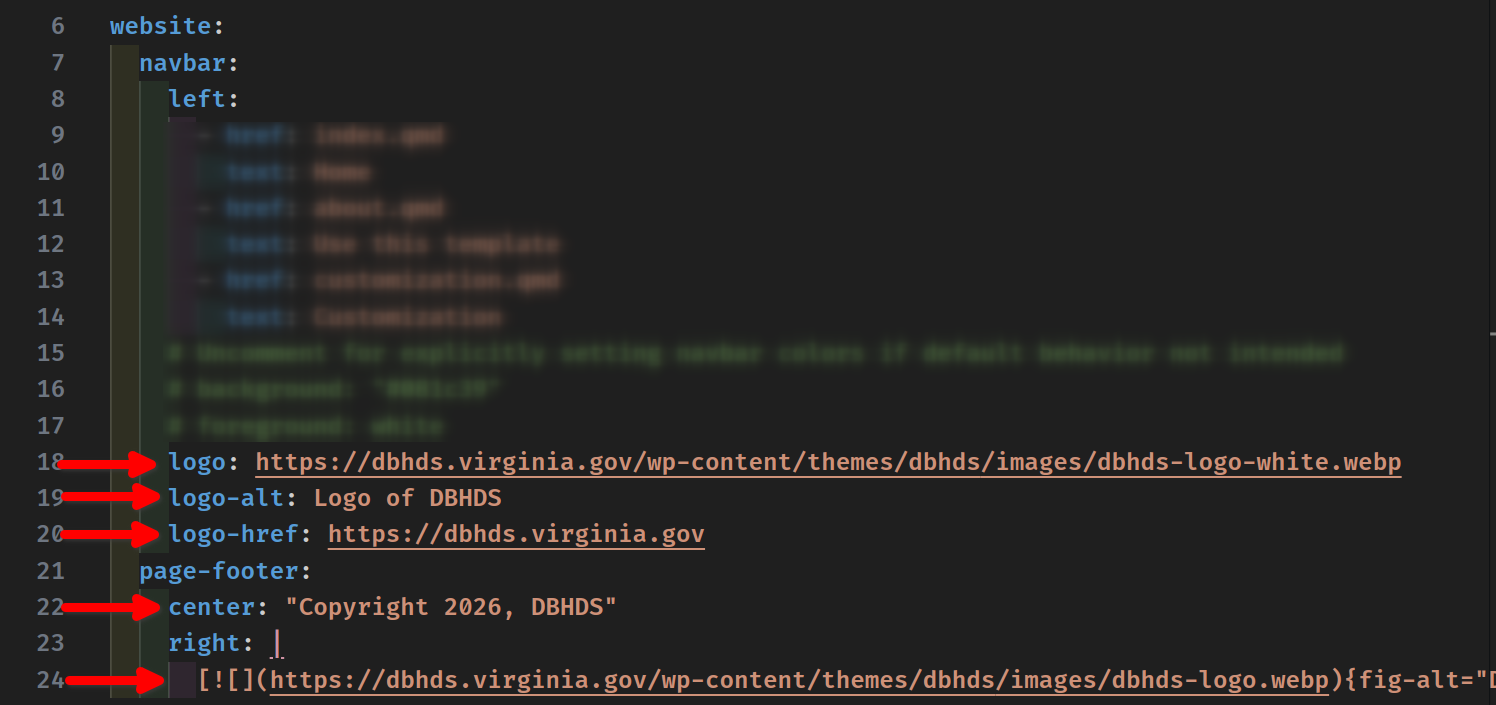
Swapping the Logo
This creates a website that still contains the Omni logo by default. To use a different logo, change the content of the _quarto.yml file. Replace the URLs that point to the Omni logo with the new logo:
Header Labels
Below are the appropriate headers and labels to use to organize reports. The first level uses “##”, second “###”, third “####”, and section labels use <div class="section-label">Section Label</div>.
First level headers (
##) are used for major sections of the report, such as “Background,” “Findings,” or “Recommendations.” These are the top-level organizational anchors and will appear in the “On this page” table of contents on the right side of the report.Second level headers (
###) are used to break a major section into subsections. For example, under a “Findings” section you might have “### Youth Outcomes” and “### Family Engagement.”Third level headers (
####) are used sparingly for sub-subsections when content requires further breakdown. For example, under “### Youth Outcomes” you might have “#### Academic Performance” and “#### Social-Emotional Well-Being.”Section labels are used as a short visual tag to introduce a block of content, typically above a stat card grid or a chart. They are styled in small uppercase teal text and are not included in the table of contents.
First Level Header
Second Level Header
Third Level Header
Section Label